The Greek - Pencils to Inks Tutorial
Pencils by Dennis Sweatt - Inks by Derek Henderson
Original pencils of The Greek.

Derek's inking process and narrative and tutorial.
"Alrighty then let's get started shall we?
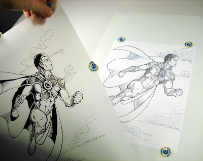
The first thing I always do is print out two copies of the work. If you don't have a printer handy... you can always take your files to a local copy center and have them print it out for you.
I had to actually do that this time around because my printer broke down and don't really have the money to get it repaired right now. Just be sure you have the artists permission beforehand to reproduce their work. You might even have to show the copy center a written letter by the artist allowing their copyrighted work to be printed. Happens sometimes depending on the copy center you do business with.
Now I have my two copies. Why two copies? Well, I ink with vellum. Vellum is a highly transparent paper that contains a smooth surface great for inking. There are many advantages and disadvantages using it... but I personally like it because I never ever have to handle original artwork.
Plus, if I really mess up the inks beyond correction... I just start over from scratch. So, I lock down my vellum sheet over one copy of The Greek so I'm ready for inking and the other will be used as reference just in case I can't make something out through the vellum and need a closer look."

"The first thing I always do before I actually begin to ink is look the artwork over real close to see if there's anything that brings question marks to mind. This process is called troubleshooting.
This can be anything and everything... from the overall composition to the most minute of details. I look for anything that I'm not sure what it is artistically speaking as well as stuff that's physically happening in the illustration I don't get either.
I also look for tangents, black fill overlapping, mis-proportions, mis-perspectives and areas that stick out like a sore thumb that might need to be addressed. I make sure I can identify everything from art style, characters, objects, special effects, backgrounds, light sources (highlights/shadows), textures and all of the other possible respective properties.
Once I've discovered anything that pops a question... I get with the artist for answers and work out resolutions to those trouble areas. I also ask the artist how much creative liberty I can have with the art. After that... it's tossin' ink time!"
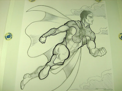
"Sweatshop's pic is really solid finished pencils overall. No major issues other than maybe his left leg being just a tad bit too short. I can tweak that with some minor adjustments. Otherwise, I mostly just had questions for him about Greek's costume and it's properties more than anything else. After a brief discussion on that stuff... I'm good to go.
Please keep in mind that everything I do in this thread here is my very own inking methodology I've developed over the years. I have certain ways and standards of doing things with my inks that you might agree with or disagree with. That's fine with me. I'm just here to show everyone my process and you may or may not learn something from it. Again... that's fine by me."

"Whatever you ink in the foreground will always set the depth foundation and line weight values for the rest of the pic. The only things that can alter that theory are special effects, light sources or intentional exaggeration.
That's what I'm going to do with The Greek here. Set the depth foundation.
Now, I'm a bold line weight inker. Meaning, I like the generally heavier line usage to really emphasize overall depth. This tends to make the artwork "jump" or "pop out" from the page to the viewer's eye. Really cartoony artwork is commonly a prime example of bold line weight. It's tough to use and be convincing for people in more serious or more realistic based artwork.
I've found though, through much trial and error, as long as I get the final artwork to carry a strong overall balance... most folks enjoy the final results. Still, there are those folks out there who prefer less line weight. Eh, that going to happen regardless. It's what I enjoy in my style... so that's what I shoot for."

"Also, I don't usually let light sources dramatically affect my line weights. Usually only in intense light use situations. This is because my lines are so thick... it's virtually pointless to. I'd rather have the colorist work their magic later on if they choose to make the light more dramatic and atmospheric.
Setting the depth foundation requires establishing a base line value to the object in the foreground. This base value can be whatever you want to set it at. I'll use my traditionally bold line weight to set that value. I don't want to set the value too thick so The Greek ends up looking cartoony and unbelievable. I also don't want to make the value too thin so the character doesn't feel like has hardly has any mass and you can barely make him out.
So I go for somewhere in between to make him look like he exists. I do this by outlining all key components of the character."

"Now, this is where I see many inkers not understand what a base value means. It doesn't mean just outline the guy in one solid thickness and boom you're done. No. A base value should still carry depth and foreshortening value as well.
In other words, varied line weight to express depth, shape and form. Just be sure the center point of the figure holds the average value to retain the overall base."

"See how I made his leg, for example, pop forward using varied line weight to express foreshortening? This was not done in the original pencils very strongly... so it falls on me to help bring that emphasis out.
Foreshortening is expressed by increasing the thickness of the line weight value as the leg gets closer to the viewer from the base value. Things going away would decrease in value the farther away it gets.
I've now set the depth foundation value for the foreground figure and minimally applied the foreshortened line weights. I'll will go back to parts of this foundation once I ink the main body to tweak & smooth out any rough and unbalanced areas. Some things to note: Ever-so-slightly extended his nose out to make his facial structure more proportional.
Left his lower left leg out for now and will be slightly extending it out later. Gave the cape tips some extra exaggerated flare and will tweak cape linage once the figure is finished.
Also, I didn't apply much foreshortening line weights to his left hand quite yet because the hand and fingers can be tricky. Don't want to overkill with line weight here or they'll come off as either too cartoony or a jumbled mess."

"My next move is to begin to flesh out the bigger details of the figure. I first start out with the major elements of the costume since it dominates the muscle structure. I'm mindful to the contours of The Greek's musculature that Sweatshop rendered so I don't get his armor and such out of whack.
You can already begin to see how quickly this figure is starting to really solidify and how our depth foundation is supporting that feel. I do see areas I really need to readjust though. However, not to worry, I make adjustments like this quite frequently as it materializes. Thus the benefit of inking foreground to background.
After I finish the rest of the major parts of the costume... muscles will be next."

"After getting the majority of the costume elements taken care of for now... I moved right on over to the muscles and definition. Since there is crosshatching in this illustration, I just focus on the true defining lines for now that show shape and form. I also gave identity to his head and foreshortened fist.
Notes: I did some minor position adjusting to the frame of his jewel encrusted chest wrap so it's more properly centered. Added some additional line weight to his arm and fist after filling in the details of his fingers."

"Cross-hatching is admittedly something I haven't done a ton of and can't say it's really one of my most favorite styles to ink. Outside of that fact, however, is to remember that it is a Grey scale shadowing effect. Which means that at some point it starts off white, becomes Grey scale (the cross-hatching) and often ends with black depending upon how hard the light source(s) are hitting the object vs. the contour(s) of the object.
Sweatshop's cross-hatching here could be taken a variety of ways depending on how soft or hard the lighting is because he kind of left this area open for interpretation. Being that this shot has an atmospheric vibe and displays this feeling of a prideful Greek flying into the sun on a somewhat clear day... I'm going to shoot for a more hardened light.
One reason is that the sun casts hard light. The other reason is that this pic overall is lacking a good composition of black vs. whites. So it really need some solid black to make this guy pop more. Especially since he's the main focus here and there's not really any other things within the pic that is competing for the viewer's eyes."

"So, before I render Sweatshop's cross-hatching... I define the black shadows based from the light source (the sun casting light from the right side of the page) before I add in the Grey scaling. I'm in that process now. See how the overall composition of the pic is starting to come through and pop out.
At the last minute here, I decided to opt out of going full cross-hatch. First reason is really easy... I don't have a ton of experience with it to really knock this one home.
Two, Dennis has provided good hatching here... but it's kind of not complete for how hard I've made the light source hit The Greek.
So I'd really have to improvise here rather drastically with an area I'm not incredibly comfortable with yet. So, being at a crossroad here (pun not intended but ironically funny)... I instead decide to go more for a feathered style approach with undertone cross-hatching since that's real close to what's already provided with the pencils. Better safe than sorry so I don't botch this puppy.
Here's what I've done thus far..."

"Now, I've incorporated a lot of minor changes to this piece along the way because Sweattshop has given me free reign with creative liberties... but if this was for an inking gig... I'd definitely want to discuss them with him before I really moved onward."
"Almost finished with the cross hatching and have been adding shadowing along the way as well. It's really starting to gain that balance of white, black and greyscale.
I changed my mind a little on the feathering and ended up adding a tad of cross-hatching. The straight forward feathering was looking okay... but didn't compliment Sweattshop's original pencils.
Here's a step back so you can see it all work together better as well as me finally getting around to a trouble spot of mine... the abdomen region. You'll also notice the "halo" effect I incorporated to help give The Greek separation from his cape so the blacks didn't all mesh together.
Coming up next is the textured and flexible metal armor that I asked details about with Sweatt before I began inking."

"I now go in with a brush pen and stipple the deeper dimples laid cast into the metal divots and apply shadowing in the process using tip pressure and spacing techniques. Some area are left untouched for the highlighted light source.
Here is another close-up shot. Not sure how well these pictures are turning out as my camera zoom doesn't always seem to take crisp pics. I think I'm moving at the last second to cause the camera to lose focus.
Anyway, the final scan will hold all of the fine details. So not to worry about the look of the final product.
The last two things for this pic are up next. The re-adjustment trick I use to lengthen his leg out just a tad still using the original pencils and then the clouds in the background.
Since the clouds and the unfinished leg are completely separate from one another... I elect to do do the clouds first. Clouds can be tricky with line weights because they can come off as having too much volume, looking too cartoony or both. So, in cases like this... I always find it best to leave stuff like this up to the colorist. So, I use my detail pen and just take in the cloud shape for coloring purposes."

Original pencils of The Greek.

Derek's inking process and narrative and tutorial.
"Alrighty then let's get started shall we?
The first thing I always do is print out two copies of the work. If you don't have a printer handy... you can always take your files to a local copy center and have them print it out for you.
I had to actually do that this time around because my printer broke down and don't really have the money to get it repaired right now. Just be sure you have the artists permission beforehand to reproduce their work. You might even have to show the copy center a written letter by the artist allowing their copyrighted work to be printed. Happens sometimes depending on the copy center you do business with.
Now I have my two copies. Why two copies? Well, I ink with vellum. Vellum is a highly transparent paper that contains a smooth surface great for inking. There are many advantages and disadvantages using it... but I personally like it because I never ever have to handle original artwork.
Plus, if I really mess up the inks beyond correction... I just start over from scratch. So, I lock down my vellum sheet over one copy of The Greek so I'm ready for inking and the other will be used as reference just in case I can't make something out through the vellum and need a closer look."

"The first thing I always do before I actually begin to ink is look the artwork over real close to see if there's anything that brings question marks to mind. This process is called troubleshooting.
This can be anything and everything... from the overall composition to the most minute of details. I look for anything that I'm not sure what it is artistically speaking as well as stuff that's physically happening in the illustration I don't get either.
I also look for tangents, black fill overlapping, mis-proportions, mis-perspectives and areas that stick out like a sore thumb that might need to be addressed. I make sure I can identify everything from art style, characters, objects, special effects, backgrounds, light sources (highlights/shadows), textures and all of the other possible respective properties.
Once I've discovered anything that pops a question... I get with the artist for answers and work out resolutions to those trouble areas. I also ask the artist how much creative liberty I can have with the art. After that... it's tossin' ink time!"

"Sweatshop's pic is really solid finished pencils overall. No major issues other than maybe his left leg being just a tad bit too short. I can tweak that with some minor adjustments. Otherwise, I mostly just had questions for him about Greek's costume and it's properties more than anything else. After a brief discussion on that stuff... I'm good to go.
Please keep in mind that everything I do in this thread here is my very own inking methodology I've developed over the years. I have certain ways and standards of doing things with my inks that you might agree with or disagree with. That's fine with me. I'm just here to show everyone my process and you may or may not learn something from it. Again... that's fine by me."

"Whatever you ink in the foreground will always set the depth foundation and line weight values for the rest of the pic. The only things that can alter that theory are special effects, light sources or intentional exaggeration.
That's what I'm going to do with The Greek here. Set the depth foundation.
Now, I'm a bold line weight inker. Meaning, I like the generally heavier line usage to really emphasize overall depth. This tends to make the artwork "jump" or "pop out" from the page to the viewer's eye. Really cartoony artwork is commonly a prime example of bold line weight. It's tough to use and be convincing for people in more serious or more realistic based artwork.
I've found though, through much trial and error, as long as I get the final artwork to carry a strong overall balance... most folks enjoy the final results. Still, there are those folks out there who prefer less line weight. Eh, that going to happen regardless. It's what I enjoy in my style... so that's what I shoot for."

"Also, I don't usually let light sources dramatically affect my line weights. Usually only in intense light use situations. This is because my lines are so thick... it's virtually pointless to. I'd rather have the colorist work their magic later on if they choose to make the light more dramatic and atmospheric.
Setting the depth foundation requires establishing a base line value to the object in the foreground. This base value can be whatever you want to set it at. I'll use my traditionally bold line weight to set that value. I don't want to set the value too thick so The Greek ends up looking cartoony and unbelievable. I also don't want to make the value too thin so the character doesn't feel like has hardly has any mass and you can barely make him out.
So I go for somewhere in between to make him look like he exists. I do this by outlining all key components of the character."

"Now, this is where I see many inkers not understand what a base value means. It doesn't mean just outline the guy in one solid thickness and boom you're done. No. A base value should still carry depth and foreshortening value as well.
In other words, varied line weight to express depth, shape and form. Just be sure the center point of the figure holds the average value to retain the overall base."

"See how I made his leg, for example, pop forward using varied line weight to express foreshortening? This was not done in the original pencils very strongly... so it falls on me to help bring that emphasis out.
Foreshortening is expressed by increasing the thickness of the line weight value as the leg gets closer to the viewer from the base value. Things going away would decrease in value the farther away it gets.
I've now set the depth foundation value for the foreground figure and minimally applied the foreshortened line weights. I'll will go back to parts of this foundation once I ink the main body to tweak & smooth out any rough and unbalanced areas. Some things to note: Ever-so-slightly extended his nose out to make his facial structure more proportional.
Left his lower left leg out for now and will be slightly extending it out later. Gave the cape tips some extra exaggerated flare and will tweak cape linage once the figure is finished.
Also, I didn't apply much foreshortening line weights to his left hand quite yet because the hand and fingers can be tricky. Don't want to overkill with line weight here or they'll come off as either too cartoony or a jumbled mess."

"My next move is to begin to flesh out the bigger details of the figure. I first start out with the major elements of the costume since it dominates the muscle structure. I'm mindful to the contours of The Greek's musculature that Sweatshop rendered so I don't get his armor and such out of whack.
You can already begin to see how quickly this figure is starting to really solidify and how our depth foundation is supporting that feel. I do see areas I really need to readjust though. However, not to worry, I make adjustments like this quite frequently as it materializes. Thus the benefit of inking foreground to background.
After I finish the rest of the major parts of the costume... muscles will be next."

"After getting the majority of the costume elements taken care of for now... I moved right on over to the muscles and definition. Since there is crosshatching in this illustration, I just focus on the true defining lines for now that show shape and form. I also gave identity to his head and foreshortened fist.
Notes: I did some minor position adjusting to the frame of his jewel encrusted chest wrap so it's more properly centered. Added some additional line weight to his arm and fist after filling in the details of his fingers."

"Cross-hatching is admittedly something I haven't done a ton of and can't say it's really one of my most favorite styles to ink. Outside of that fact, however, is to remember that it is a Grey scale shadowing effect. Which means that at some point it starts off white, becomes Grey scale (the cross-hatching) and often ends with black depending upon how hard the light source(s) are hitting the object vs. the contour(s) of the object.
Sweatshop's cross-hatching here could be taken a variety of ways depending on how soft or hard the lighting is because he kind of left this area open for interpretation. Being that this shot has an atmospheric vibe and displays this feeling of a prideful Greek flying into the sun on a somewhat clear day... I'm going to shoot for a more hardened light.
One reason is that the sun casts hard light. The other reason is that this pic overall is lacking a good composition of black vs. whites. So it really need some solid black to make this guy pop more. Especially since he's the main focus here and there's not really any other things within the pic that is competing for the viewer's eyes."

"So, before I render Sweatshop's cross-hatching... I define the black shadows based from the light source (the sun casting light from the right side of the page) before I add in the Grey scaling. I'm in that process now. See how the overall composition of the pic is starting to come through and pop out.
At the last minute here, I decided to opt out of going full cross-hatch. First reason is really easy... I don't have a ton of experience with it to really knock this one home.
Two, Dennis has provided good hatching here... but it's kind of not complete for how hard I've made the light source hit The Greek.
So I'd really have to improvise here rather drastically with an area I'm not incredibly comfortable with yet. So, being at a crossroad here (pun not intended but ironically funny)... I instead decide to go more for a feathered style approach with undertone cross-hatching since that's real close to what's already provided with the pencils. Better safe than sorry so I don't botch this puppy.
Here's what I've done thus far..."

"Now, I've incorporated a lot of minor changes to this piece along the way because Sweattshop has given me free reign with creative liberties... but if this was for an inking gig... I'd definitely want to discuss them with him before I really moved onward."

"Almost finished with the cross hatching and have been adding shadowing along the way as well. It's really starting to gain that balance of white, black and greyscale.
I changed my mind a little on the feathering and ended up adding a tad of cross-hatching. The straight forward feathering was looking okay... but didn't compliment Sweattshop's original pencils.
Here's a step back so you can see it all work together better as well as me finally getting around to a trouble spot of mine... the abdomen region. You'll also notice the "halo" effect I incorporated to help give The Greek separation from his cape so the blacks didn't all mesh together.
Coming up next is the textured and flexible metal armor that I asked details about with Sweatt before I began inking."

"I now go in with a brush pen and stipple the deeper dimples laid cast into the metal divots and apply shadowing in the process using tip pressure and spacing techniques. Some area are left untouched for the highlighted light source.
Here is another close-up shot. Not sure how well these pictures are turning out as my camera zoom doesn't always seem to take crisp pics. I think I'm moving at the last second to cause the camera to lose focus.
Anyway, the final scan will hold all of the fine details. So not to worry about the look of the final product.
The last two things for this pic are up next. The re-adjustment trick I use to lengthen his leg out just a tad still using the original pencils and then the clouds in the background.
Since the clouds and the unfinished leg are completely separate from one another... I elect to do do the clouds first. Clouds can be tricky with line weights because they can come off as having too much volume, looking too cartoony or both. So, in cases like this... I always find it best to leave stuff like this up to the colorist. So, I use my detail pen and just take in the cloud shape for coloring purposes."


this is so cool! the drawing is so clean and super crisp!
ReplyDeletehands down!
I really appreciate that.
ReplyDeleteThanks.