Draw Over! #1 – Marvel Samples by Matt Zolman | ComixTribe
What is Draw Over?
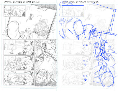
Draw Over! is a new ComixTribe featured column, where a professional comic artist reviews pages of submitted sequential art from the portfolio of a fellow comic artist. Where beneficial, the artist will do “draw overs” by taking a digital blue pencil to the submitted page to illustrates areas for improvement (panel to panel flow, anatomy issues, perspective problems, etc.) The artist will also provide some general tips for improving the samples.
This Week’s Artist…
The first artist stepping up to bat is Matt Zolman. Matt is a talented graphic and multimedia designer with a lifelong passion for comics. Over the past several years, Matt’s been working hard to improve his skills as a sequential story teller. Matt is currently working on EPIC, a new super teen comic book series. Matt was gracious enough to submitted five pages of Marvel samples featuring the Hulk for critique. Let’s get right to it! (Click on the images to see in full size.)
The Draw Over! Critique
Page 1

Panel 1 is fine.
Panel 2 I couldn’t really tell what was going on at first. I feel the problem is the foreground. I’m not 100% sure if he caused the crate to fall or not. So I decided the action caused it so I made the pushing of the lever obvious. Either way, I felt pushing in on the guy with the monkey framed the shot better.
Panels 3-5 are fine, but I felt Matt should progress the expressions more to BUILD tension.
Panel 6 I felt the size of the monkey was too large and the flow could be tweaked. I also thought Namor’s pose was weak. Torque the body more. Also focus on the basic shapes before you commit. My pose, though it’s been done before, is a better way to go. That’s why it’s a common pose.
Page 2

Panel 1 I wanted the monkey guy to look like he got knocked on his butt. It also gives us the chance to see where the monkey went and that Namor is still coming.
Panel 2 I’m torquing the body again, and I put the monkey in the foreground. Probably could have taken the time myself to reframe the panel, but I also want a chance to show how little things can really help story telling, even if it’s not the optimal shot. Focus on the basic shapes. Can’t stress this enough. It seems too basic and a waste bit it is 10000% the best route to go.
Panel 3 I thought it was time to push the camera in and punch up the drama. Matt sticks with medium rage shots a bit too much.
Panel 4 is OK
I thought there was too big of a jump in time so I added a panel.
Panel 5 Monkey man is walking up on Namor and Namor is recovering.
Panel 6 Now Namor springs into a back hand.
Panel 7 is fine. Not sure whose hands, but good craftsmanship and spot blacks.
Page 3
Panel 1 is pretty cool.
Panel 2 Hulk’s pose isn’t natural enough for me. Focus on how I connect the hip into the back. The back needs to lean back so naturally a leg should slide under him to balance.
Panel 3 I tinkered with the pose and switched legs. You swing toward the leg in front.
Panel 4 is fine. Reference some water. Even though you are toony you should still reference stuff like this.
Panel 5 Hulk seems thin front to back. Also pay attention to the muscles when you move. You kinda drew the peck as tho the arms are down but he is lifting. They stretch up. Also spot some blacks. Make it an ominous situation
Page 4
Panel 1 is fine. Nice acting.
Panel 2 I posed Hulk a bit more dynamically. Focus on my shapes and how I connect them. It’s really easy once you make yourself do this first.
Panel 3 I feel the need to make the hand grabbing the Hulks leg look like it’s strong enough to pull him through the floor.
Panel 4 Wasn’t a fan of the view so a swung the camera around to kill the symmetry. Pushing Hulk to one sidelLeaves room for a cool sound effect.
Panel 5 Who is the guy standing? Looks like Namor. Isn’t he pulling Hulk through the floor? If it’s another underwater dude then add him in. I changed the angle to get some reaction to what JUST happened. “WHOA!”
Panel 6 Slight mod to Namor. Wanted more gesture and flow for being pulled through the water. Draw a “Line of Action” And make the characters work around it. Changed how Hulk’s head is connected for the same reason. Practice and study gesture a bit more. You probably know most everything to fix issues like these, you just forget you know them. I know I do all the time. Keep everything simple and follow the basic rules of drawing. It’ll make the detailing seem way way easier if you have a proper framework to build on.
Page 5
Panel 1 I really like the layout in panel one. I tweaked Namor’s figure to match a sweeping gesture of the punch. Hulk pose was mostly ok but the forms of the arms got away from you. SIMPLE SHAPES FIRST, then draw them muscles! (Lol.)
Panel 2 I flipped it to keep the eye flowing. It may break the 180 rule so you might flip panel one just in case it bothers you.
Panel 3 Hulk didn’t look like he got punched, so I torqued his body so we felt the punch. Also Namor’s legs needed to be swapped. When you run or punch it’s right arm forward, left leg forward and vice-versa.
Panel 4 is fine. Great acting again.
Panel 5 Really love the layout of this. Letting us breath as readers. Simple shapes just to show how I build up.
Analysis & Recommendations
I know Matt is a bit further along than this and he served as the guinea pig for Draw Over! I don’t know the script, so without words it’s hard to get the full story. No mater how awesome a story teller is, without words some things just don’t make sense. That being said, I think Matt as with most artists close to being pro or semi-pro (myself included) tend to make things harder than they should be. Also, simple things like leaving room for balloons comes with time. Once you see a sweet arm or leg covered by a balloon, you’ll start thinking about where they go.
Matt’s style is easy on the eyes and not cluttered at all. He does however need to think about activating the negative space. Colors can do it, but so can spotting blacks. The last panel on page 5 is a great example of activating the negative space. Not much actual drawing but it feels alive and visually looks great. I suggest Matt take a sharpie and break his drawing down into basic shapes and see where he can improve. Easy to do and you SEE your own work better.
Finally, he needs to push and pull the camera in and out. Page 5, he does this well. Pages 2-4 were kinda lacking camera work. Check out Adam Kubert and Greg Capullo for camera masters.
Thanks to Matt for going first. Follow him on twitter @MattZolman and watch him grow as an artists. I have no doubt he will. I’d guess a couple more years and he’ll be able to think about doing this for a living. Maybe sooner, depending on how much time he has available to put in. Really that’s all is boils down to, using your time to STUDY as you go.
See you next time!
- Tommy Patterson
Draw Over! #1 – Marvel Samples by Matt Zolman | ComixTribe


Comments
Post a Comment
Thanks for visiting Dennis Sweatt Comic Book Art! Find us on Twitter @sweattshop.